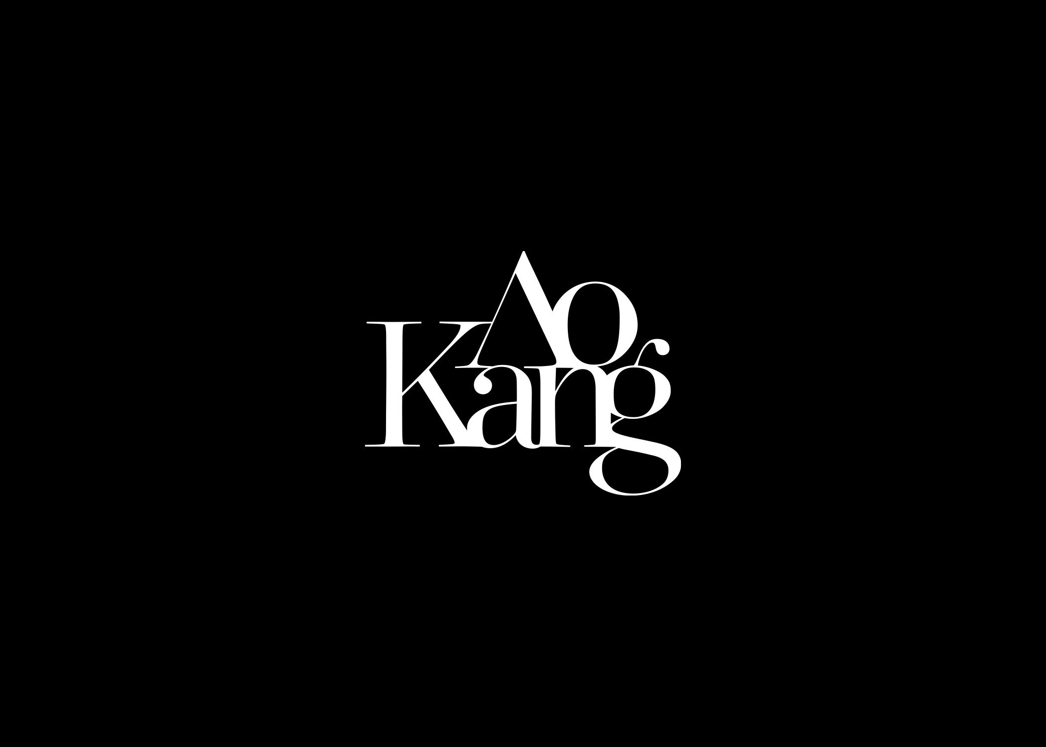
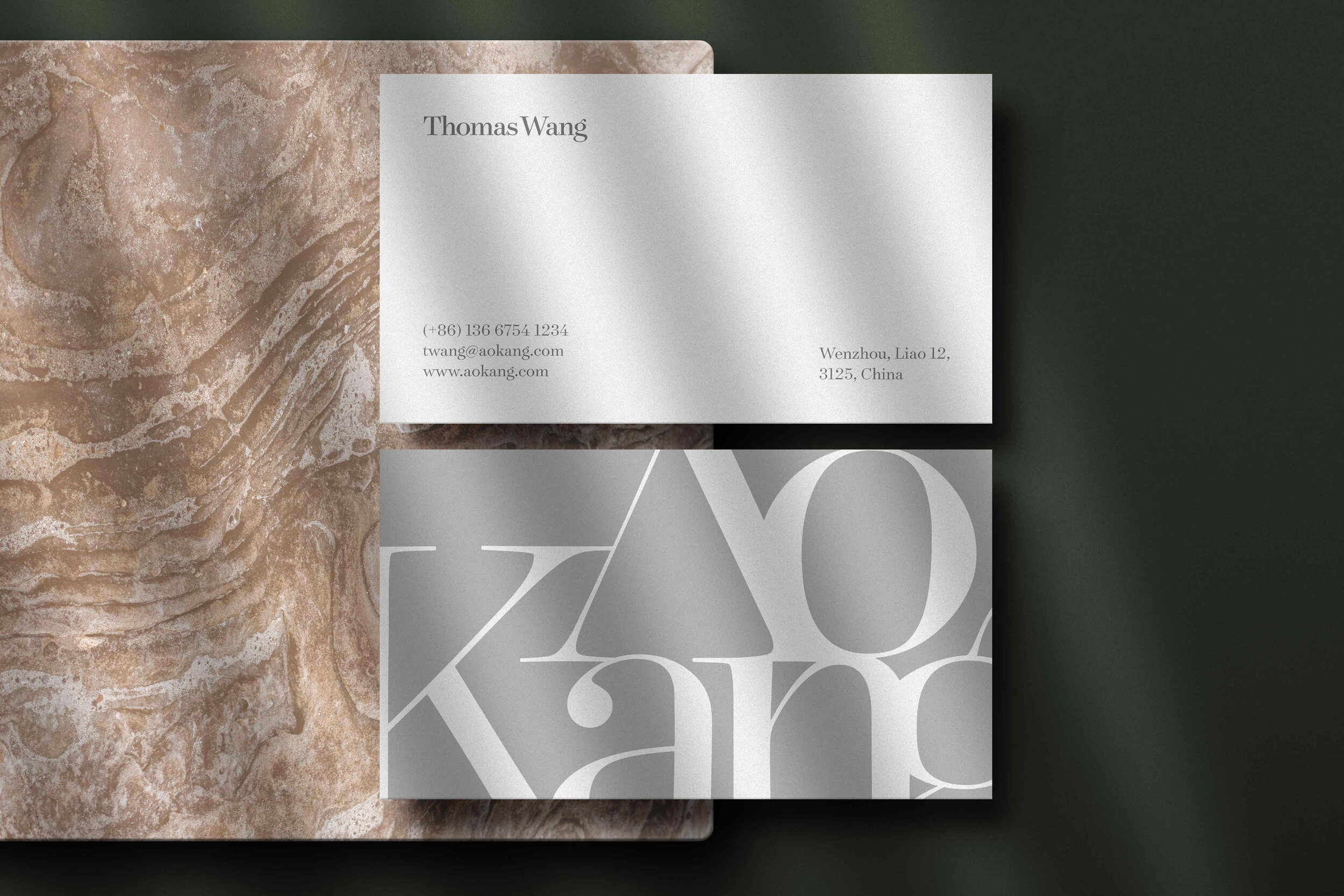
AoKang, as one of the most prominent fashion design and manufacturer company in China. This brand identity is for the new line for AoKang, which is targeted for the younger market, more dynamic in the visual language, at the same time maintain the elegance, but still at an affordable price. In the highly saturated market, it is crucial to make a brand identity that can differentiate from its competitors—with the customized typeface and unusual arrangement to create a unique look for the logotype. At first glance, the logo shows elegant and refined; a closer look reveals the rigorous, systematic details.
The logotype customized from the typeface contemporary and elegant Surveyor Fine but adjust the height and weight of it to make the logotype looks more unified and cohesive. Take off the crossbar in A to give the whole logotype a unique appearance and also indicate that the outstanding design and quality in AoKang products